
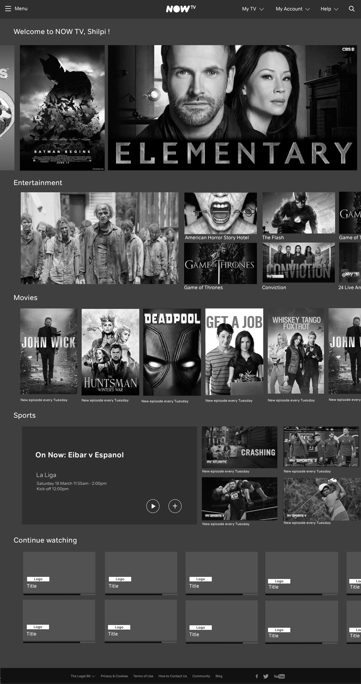
NOW TV (SKY Ticket)
Perfecting Content Discovery
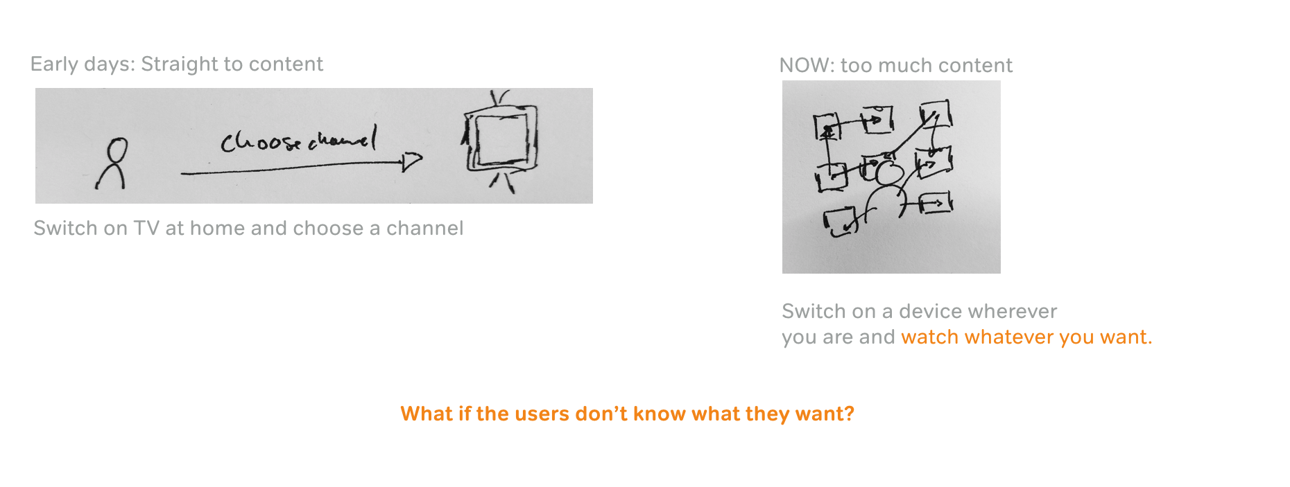
In 2014, streaming Sky content on NOW TV felt magical. By the start of 2016, this magic disappeared to a mix of different features and pages that made the experience slow, complicated and content hard to find.
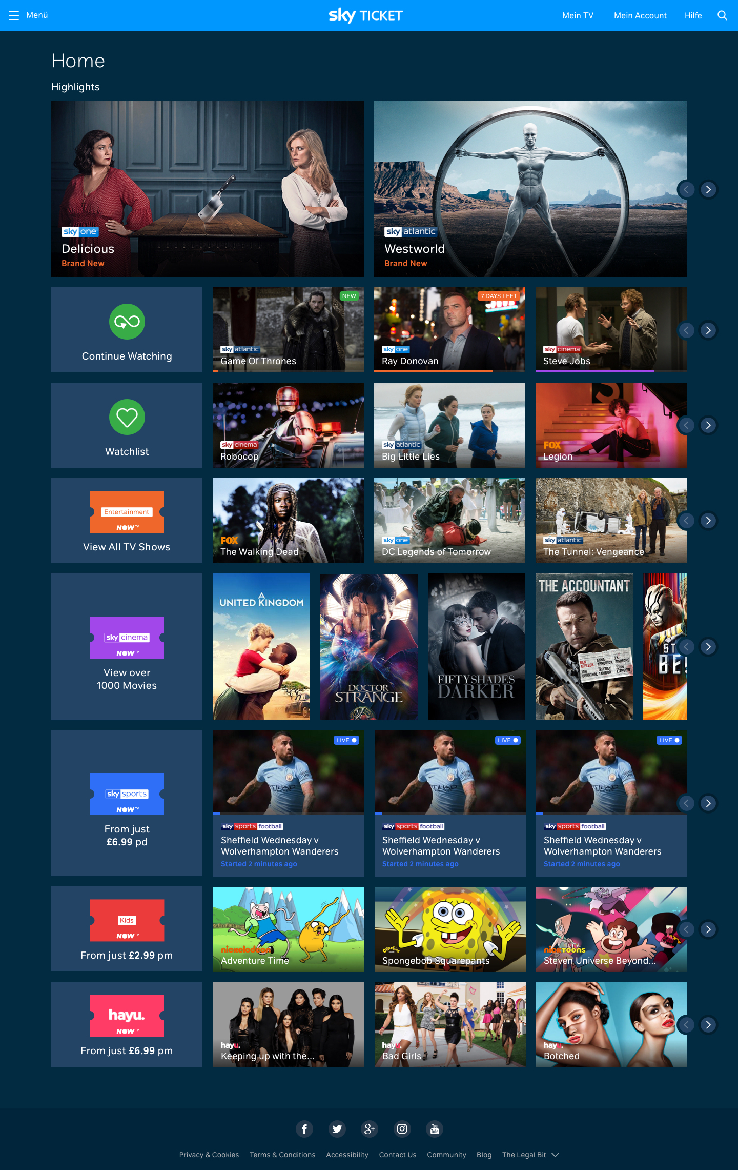
I was part of an ambitious project to redesign the NOW TV content discovery experience across all devices, starting with the web product. It was exciting to be part of one of the UK’s most popular streaming services and see it rolling out internationally under different brands (e.g. Sky Ticket in Germany)
How can the content discovery be improved and help users to find the content they are looking for?
The final result:
The challenge
Initially the NOW TV domains were presented as individual products. Our question: How can we help users find content they are looking for or explore new things to watch?

As a first step, we modified the global navigation to allow it to emphasize a focus state.
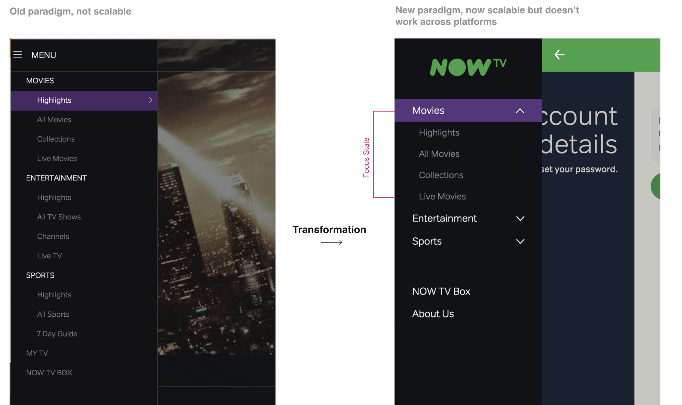
That focus state worked nicely on the web:
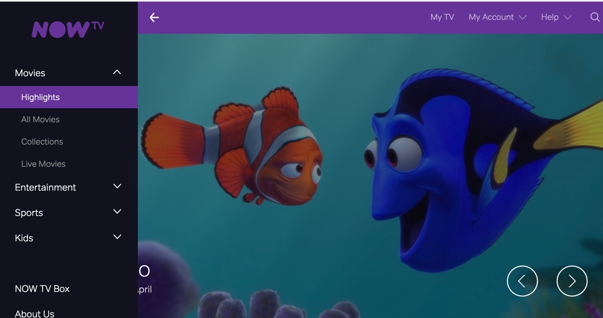
Unfortunately not across all devices.
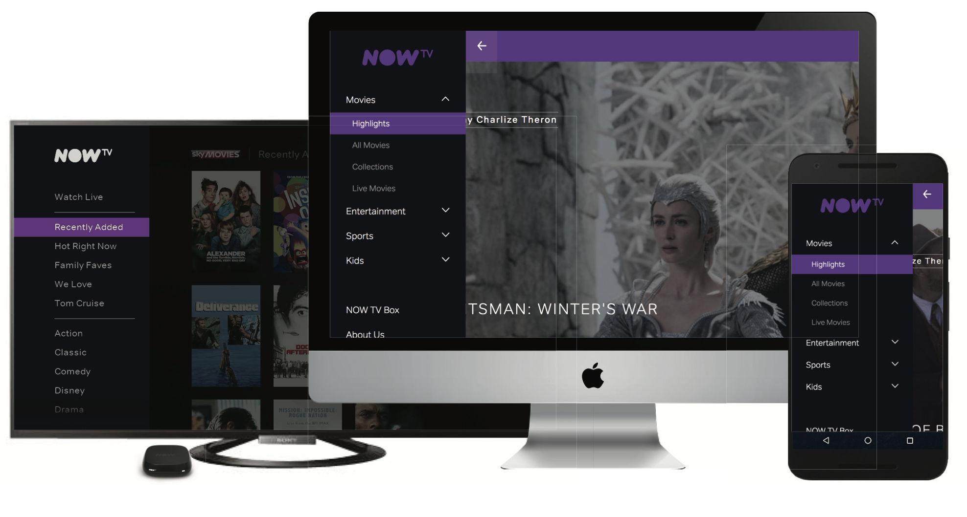 This was the moment when we took a step back and analysed the service from a holistic point of view:
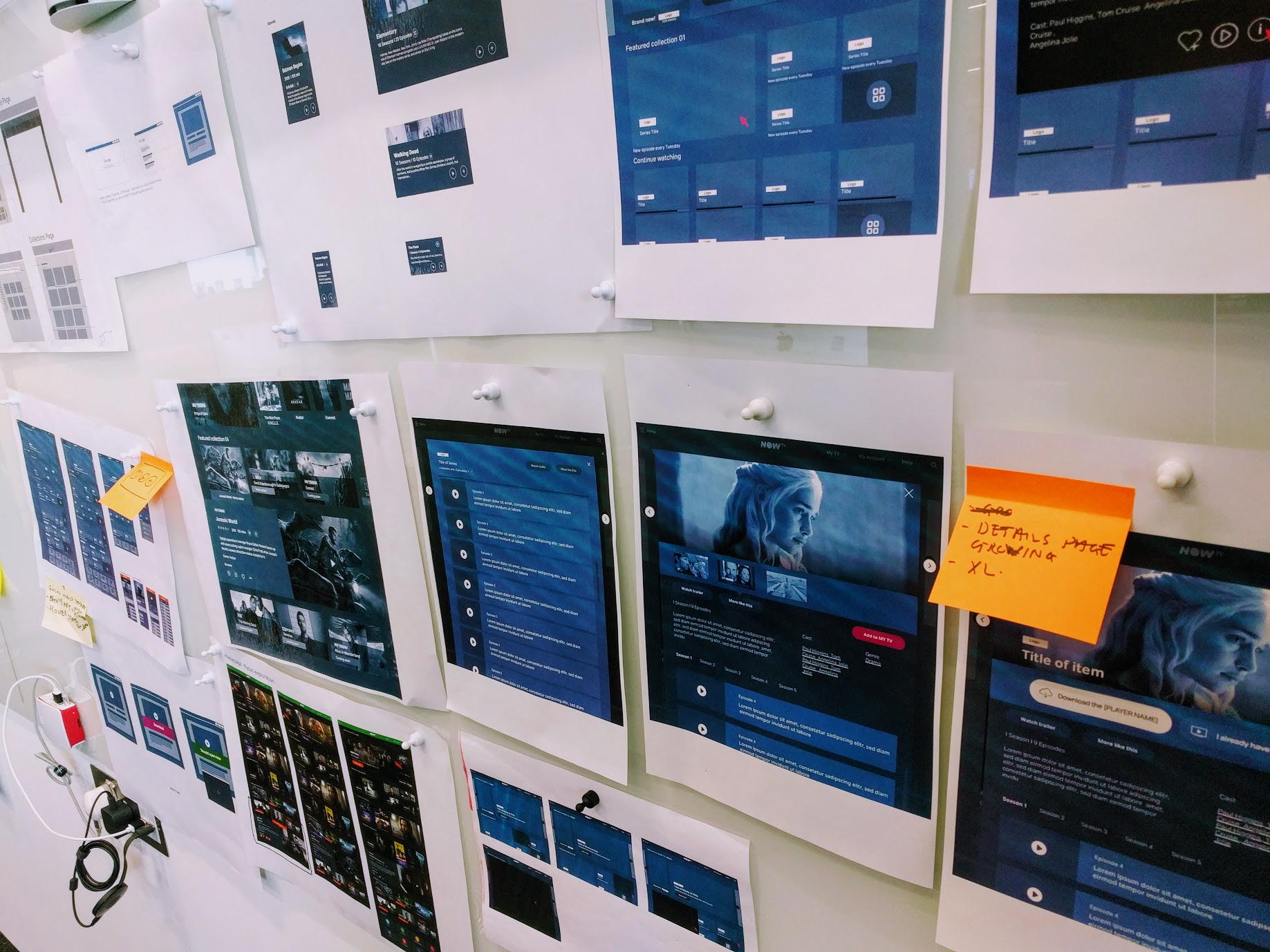
We redefined the content structure with the editorial team…
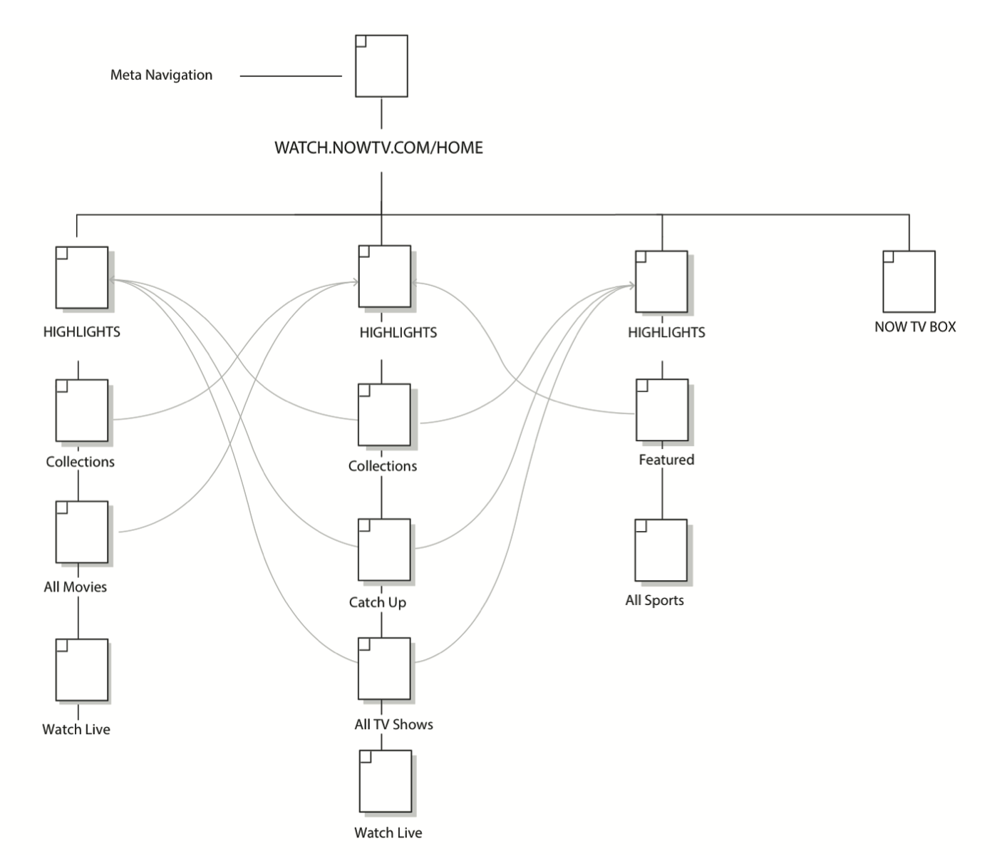
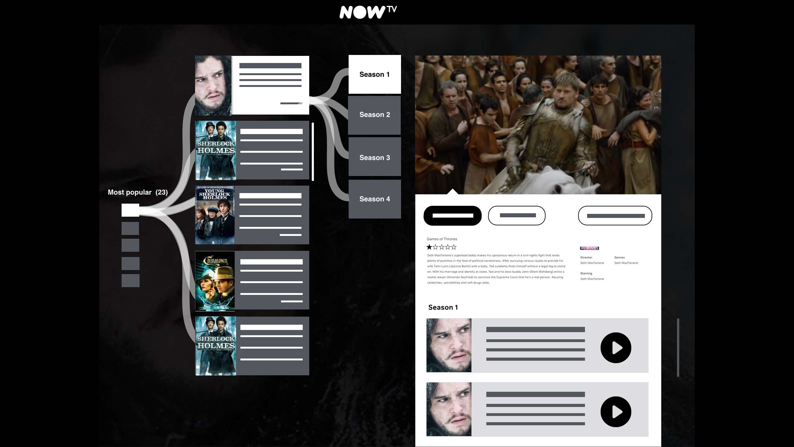
… and We realised very quickly how dynamic this structure was. On top we had to consider other elements from the service navigation. 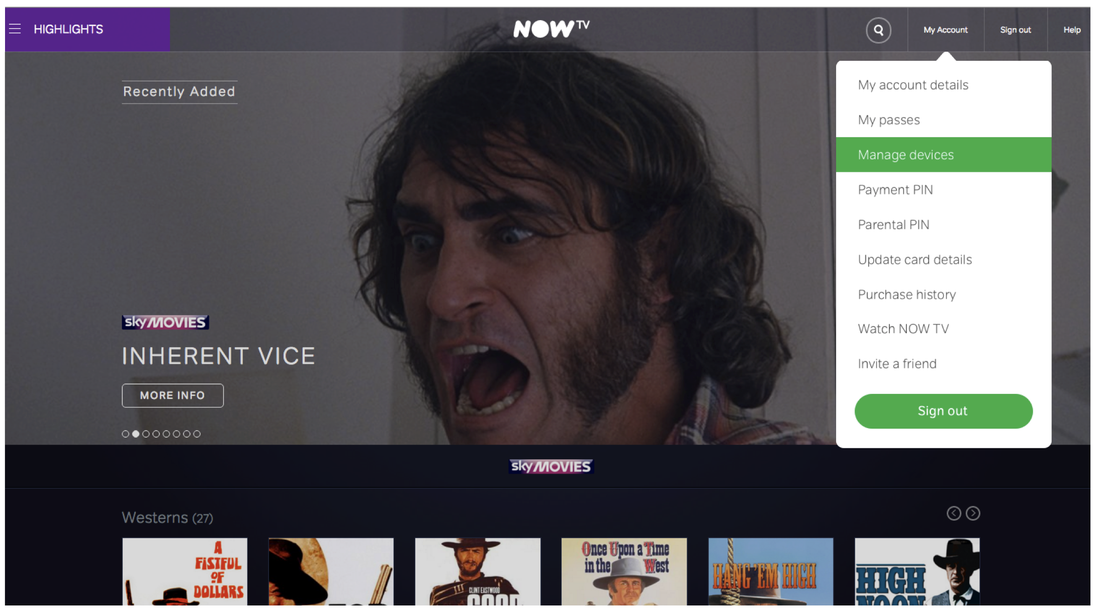
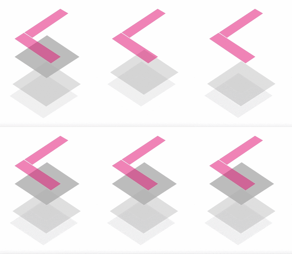
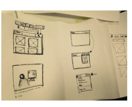
We decided to conceptualise a consistent navigation grid, which is independent of the content shown.
 .
.
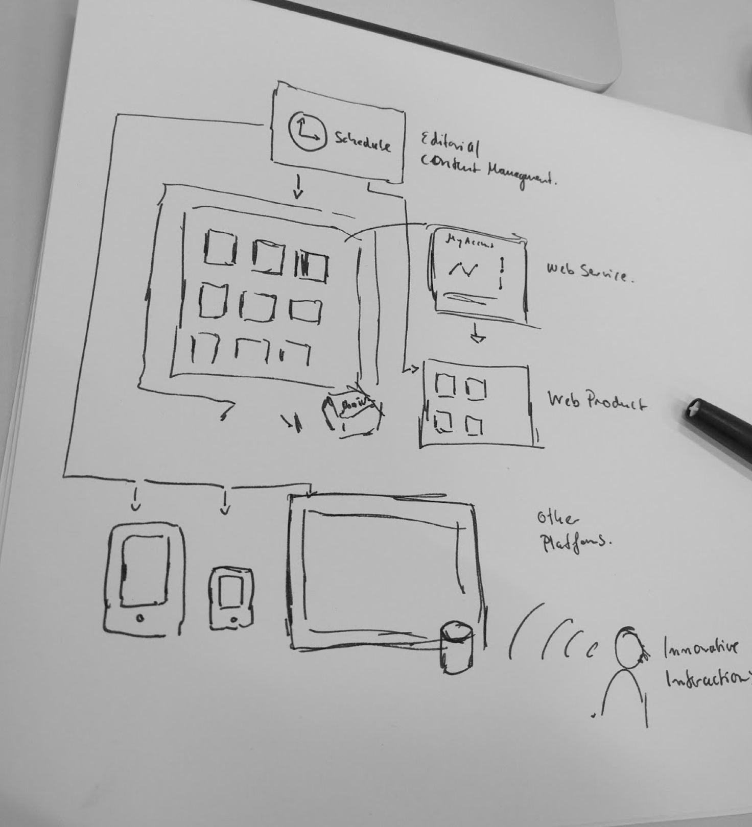
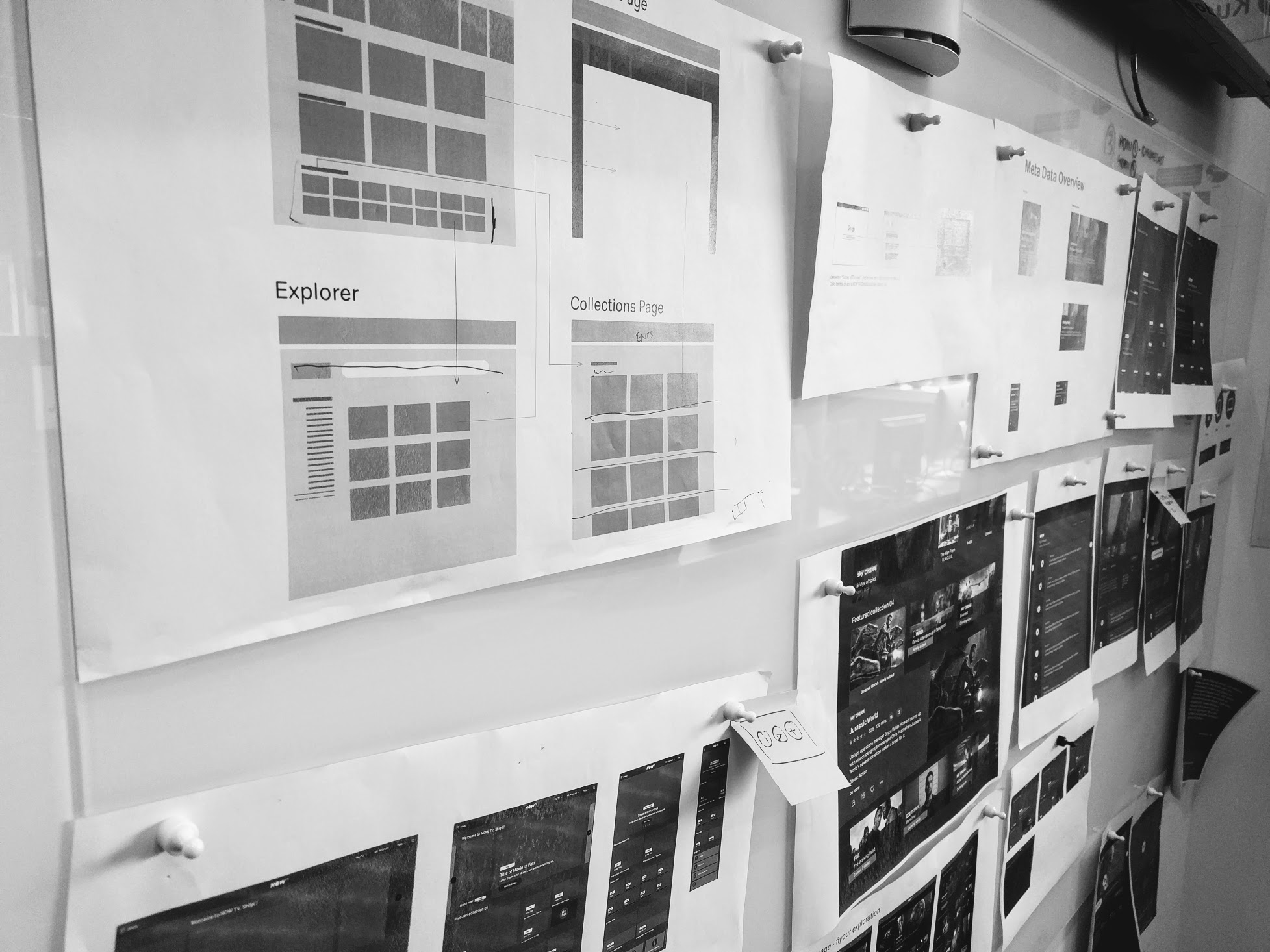
Wireframed them up
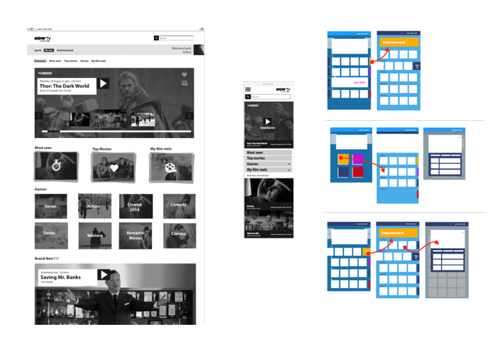
We tested different variations:
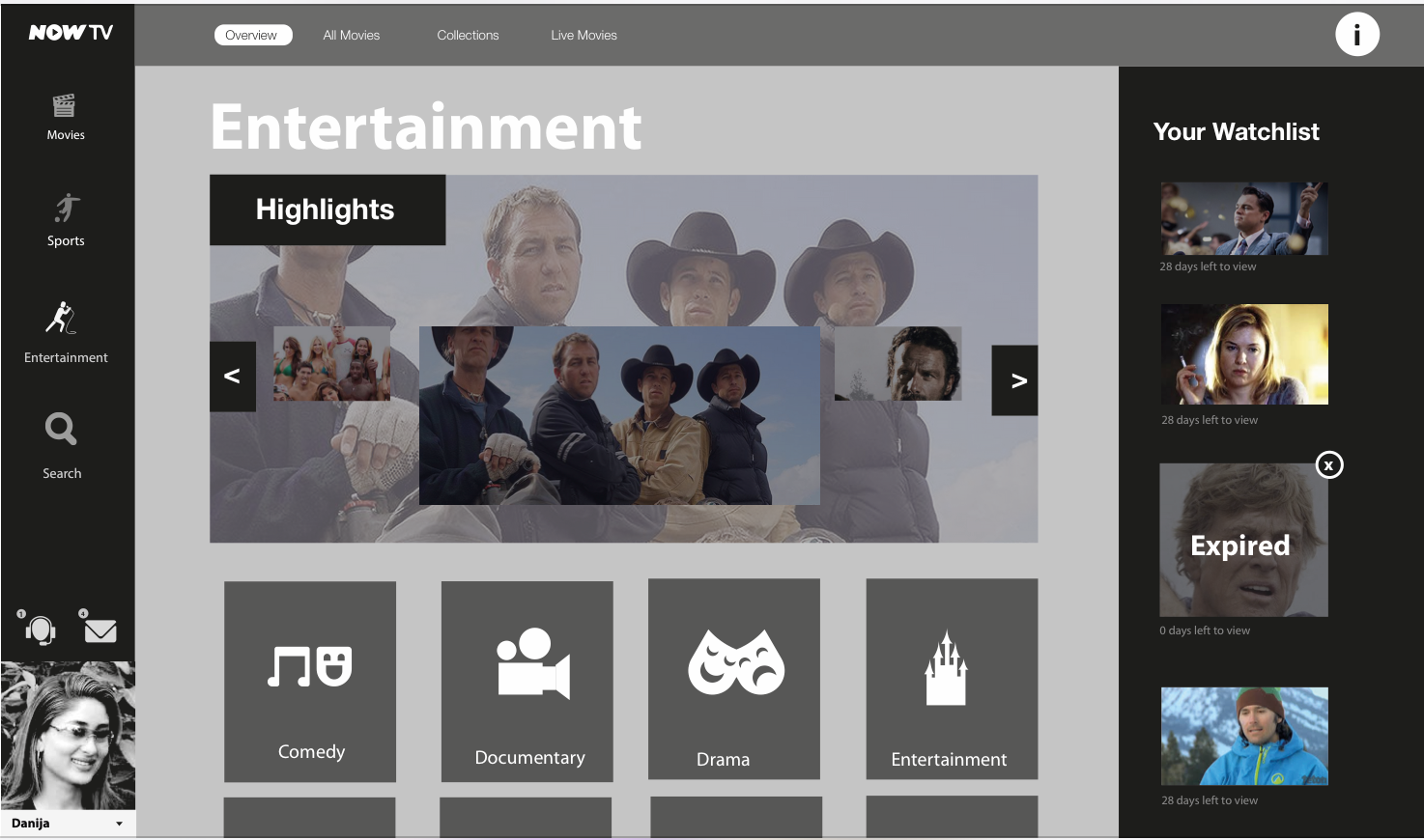
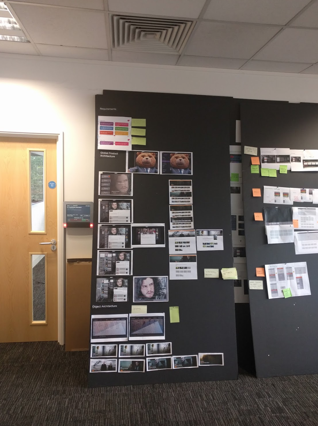
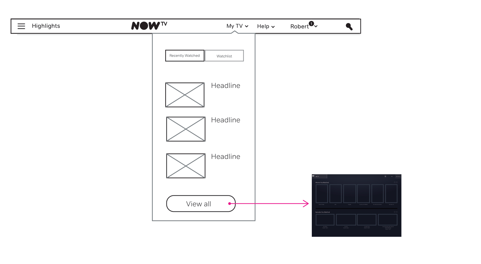
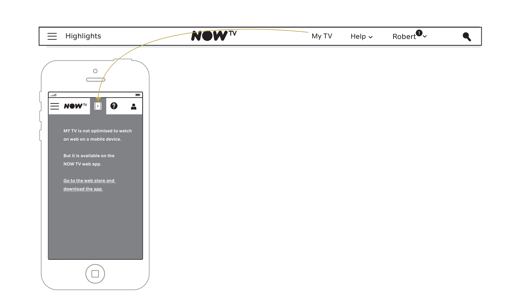
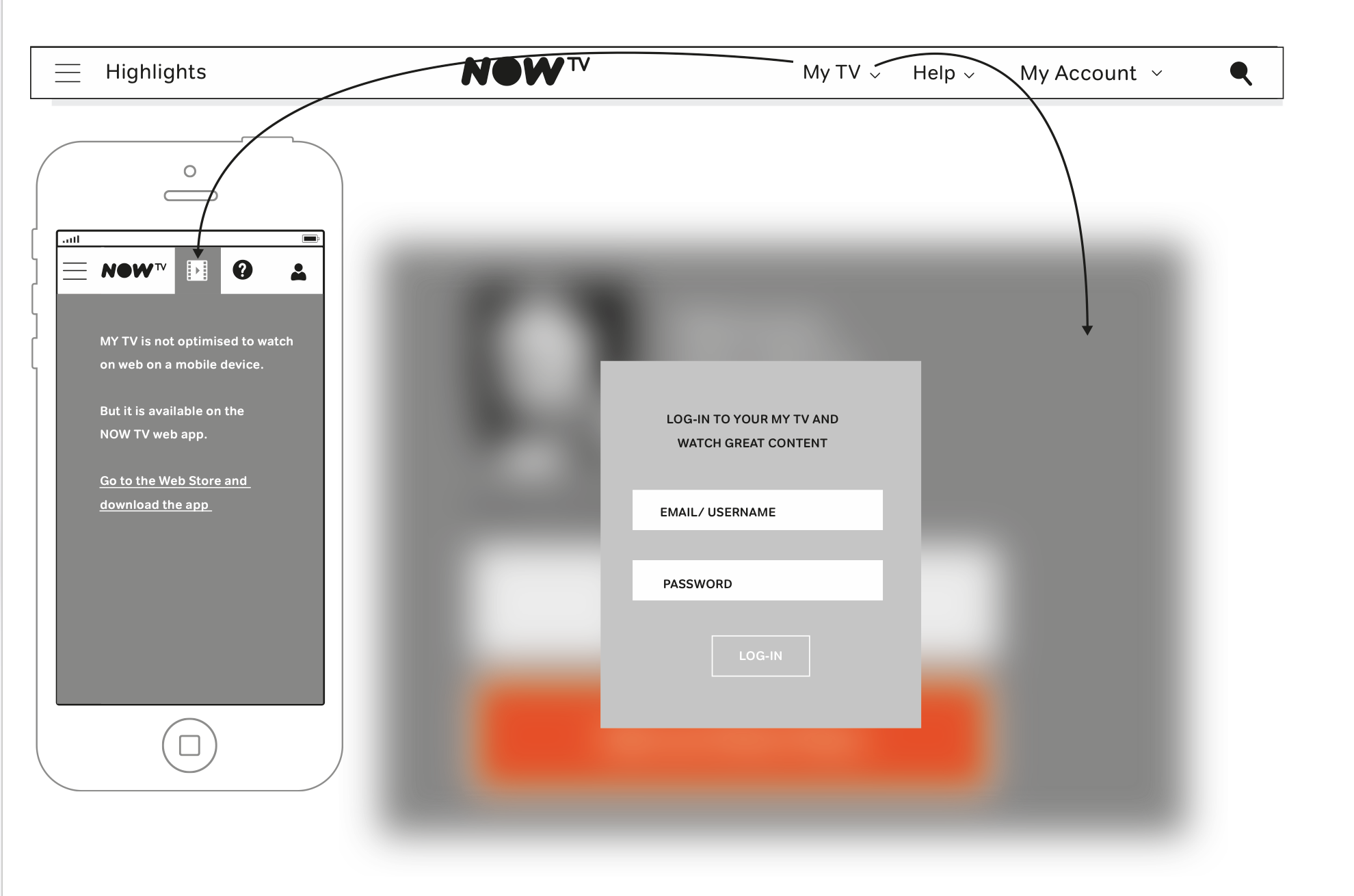
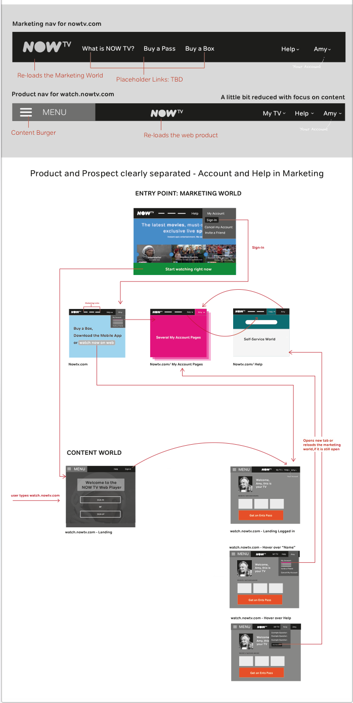
We agreed on one final solution which we tested across platforms:
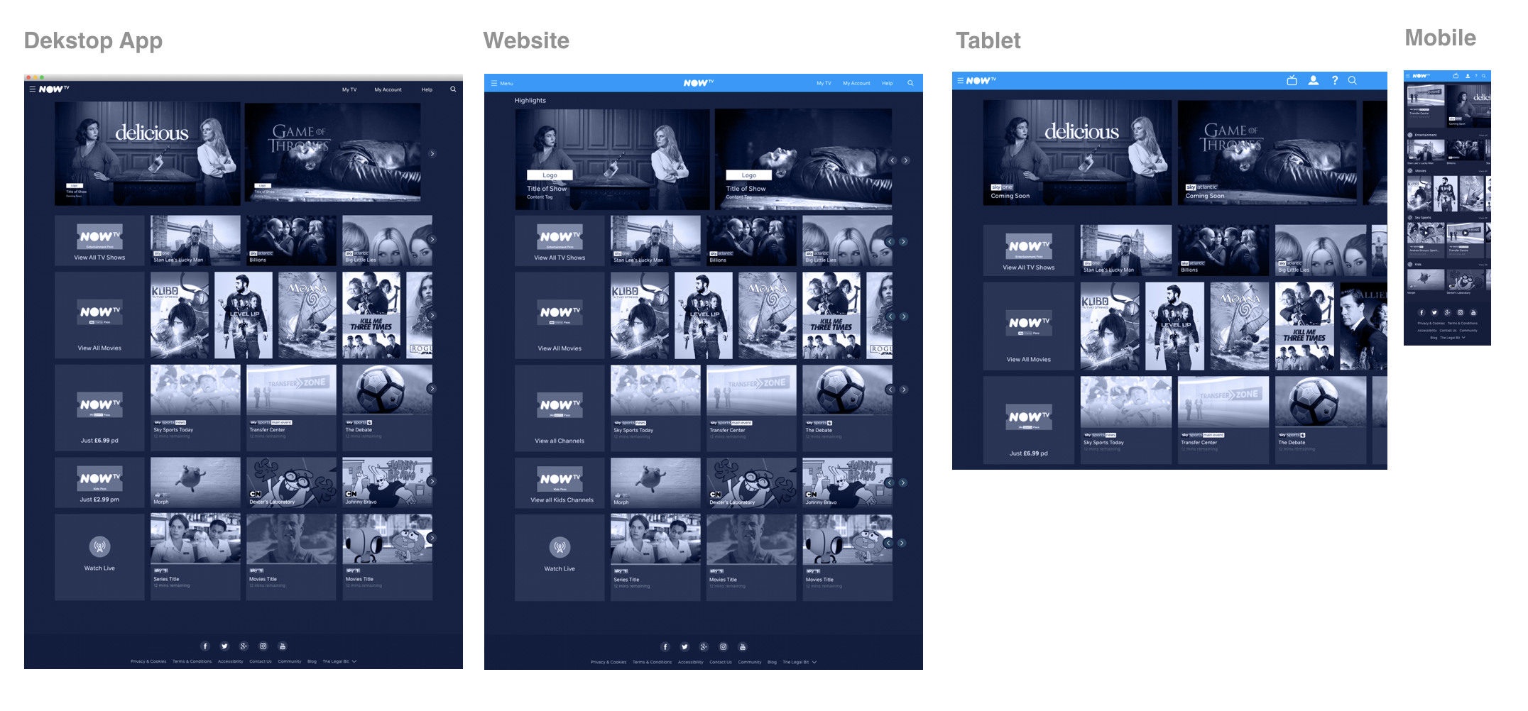
We prototyped this solution with Framer to understand how different interactions would work out:

Ultimately we refined this variance in a final ui prototype (worked with a team of 5 other designers who were all inviolved in this while I finalised the prototype):
We user tested it in several countries, refined, re-iterated…
…and we delivered it!
Our number of playouts went up by 77% on desktop, 150% on tablet and 80% on mobile.